Shoes that stand the test of time... Septième Largeur evolves thanks to you. Today we are happy to share our new brand image with you.
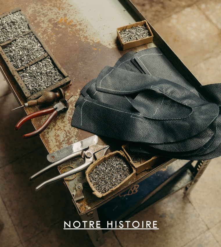
For 14 years, Septième Largeur has made it its mission to make high-end men's shoes accessible to as many people as possible. Over the years, our House has continued to improve its artisanal shoe design techniques as well as the art of coloring leather, called Patina.
“Since the beginning of the history of the House, the emphasis has been placed on the product and ultimately little on its packaging, the content more than the container. It was time to dress our shoes, give them a dress that matches the quality they offer us”

From a name, a story that is written to the rhythm of time
7L initially took its name from the shoe technique, through the foot measurement system used by all shoemakers around the world. Today, more than just a technique, it is all the times of creation that we wish to share with you. From artisan to artisan-creator, there is only one step that we take.
The manifesto
7L like 7 times , from the creation of the shoe to the life of the person who wears it. Our desire here is to reappropriate time and reinvent it to offer you a timeless experience: seven chapters, seven moments of style and character that write our new Manifesto.
With the evolution of our identity, we reaffirm our history. A story guided by time , a story that takes time . The communications agency 4uatre which supported us tells it here:
“Behind the idea of time, there is first of all each of the times of the creation of shoes, but also the rest of their history, since they accompany those who wear them for a long time. The strength of this concept is that it allows us to tell the brand's know-how in a different way, while highlighting the attention that 7L pays to each creation, and to each customer. »

A new visual identity
It was quite natural that we decided to call on David Polonia, a graphic designer who has already made many Houses shine, such as our friends at BonneGueule or l'Exception, to rework our visual identity around this concept of time .
The color range
The color range was one of the most difficult points to rework. It was the subject of many back and forths, without ever finding the perfect palette. We were indeed looking to modernize it while keeping the burgundy to which we were attached.
Too dark or too bland, too sad or without body, no color found taste in our eyes. However, it was thanks to Mathieu's greed that the perfect color was found. It was during a trip to Brazil that while eating one (or more) bowls of acai, he found the perfect color. With its deep and luminous color at the same time, the acai fruit directly inspired our work.

The logo
Our logo had changed little since its creation in 2009. Initially inspired by handwriting, it was no longer aligned with the quality that our House offers.
The idea was not to create a rupture, nor a revolution, but to initiate an evolution, to use David's words. It is thus naturally that the new symbol refers to the old one, but benefits from a more geometric treatment.
A first version was quickly discarded because it seemed too harsh and did little to convey the artisanal gesture which remains one of the cornerstones of our House. The lines today create the right balance between high-end and softness.

“The 7 and the L are now halves of an equilateral triangle, which balances them and allows them to be used on possible designs. In order to continue the work initiated by the 4uatre teams and the evocation of the 7 stages of the life of a shoe, we also worked on a secondary symbol, representing the symmetry of the 7 and the L, but in the manner of a watch dial whose indexes would be duplicated 7s."

“The main typography has also evolved towards a more geometric and high-end rendering; this is a customized and softened version of a Futura. It is accompanied by a chiseled and elegant serif industrial font, the Freight, designed by Joshua Darden. We have started to apply these new choices on many supports, I can't wait for you to discover them all, especially the tissue paper pattern, because the latter has not escaped my eternal fad: patterns made the hand !"

A story that continues to be written
And then ? Our e-shop has already had a makeover. New logos and colors are available throughout the product pages for a more refined and modern look, where the shoe remains at the heart of all considerations.


Boutique Rive Droite
59 rue Saint-Lazare, Paris 9th arrondissement
Boutique Rive Gauche
5 rue Coëtlogon, Paris 6th arrondissement
The deployment of the new identity will soon also begin in our stores, where we always enjoy welcoming you on a daily basis. We would like to take this opportunity to thank you for your loyalty and your ever-renewed trust in our teams.
We would like to once again thank the entire 4uatre team as well as David Polonia who supported us throughout this project.
The 7L Team

Similar articles


